Fundbox rebranding
Branding / Marketing design / Web / UX / UI
The goal of this project was to create and implement a new brand for Fundbox, representing a more mature and established Fundbox. It included a new logo, new color pallette, marketing website, and more.
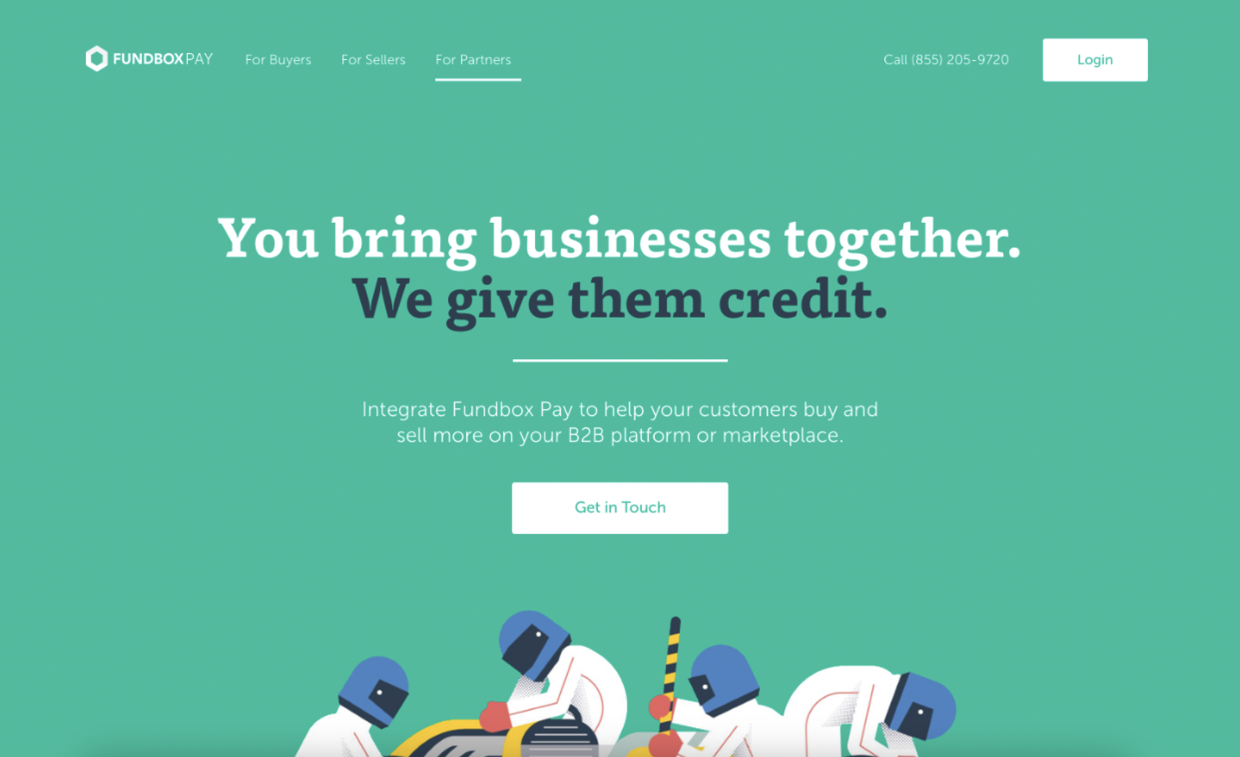
Fundbox of 2013 (Old brand)
Fundbox of 2013 has users that are small business owners, unequipped to tackle challenges. It has basic, initial product, making decisions in a Startup state of mind - grow as fast as possible to build a solid customer base.
Defining our mission
We started by defining our mission, our vision and what type of users are we trying to appeal to.
To unlock growth for driven business by accelerating payments and credit
Then we went ahead with asking the important questions:
Is it distinct (in and out of our category)?
Does it embody the DNA of the brand? (We boiled this down to 4 words: Energetic, Bold, Dinamic,Transparent)
Is the system flexible and scalable?
Is it better than what we have?
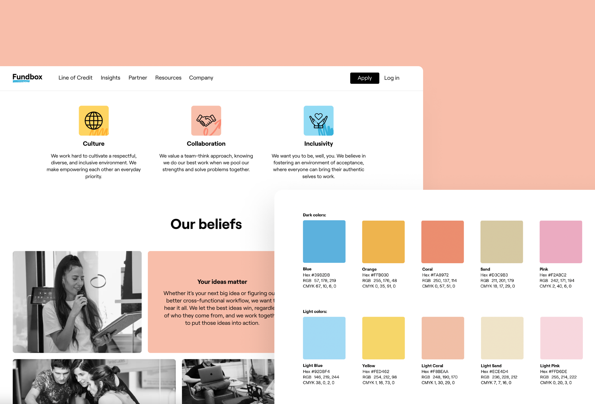
New color pallette
Dynamic, flexible and communicates new energy
Creating visual elements for the graphic language
To represent movement, energy and a way forward for business
The logo
I designed the new Fundbox logo with an intention to differentiate Fundbox from other competitors and serve as a recognizable anchor that communicates trust, boldness and movement.
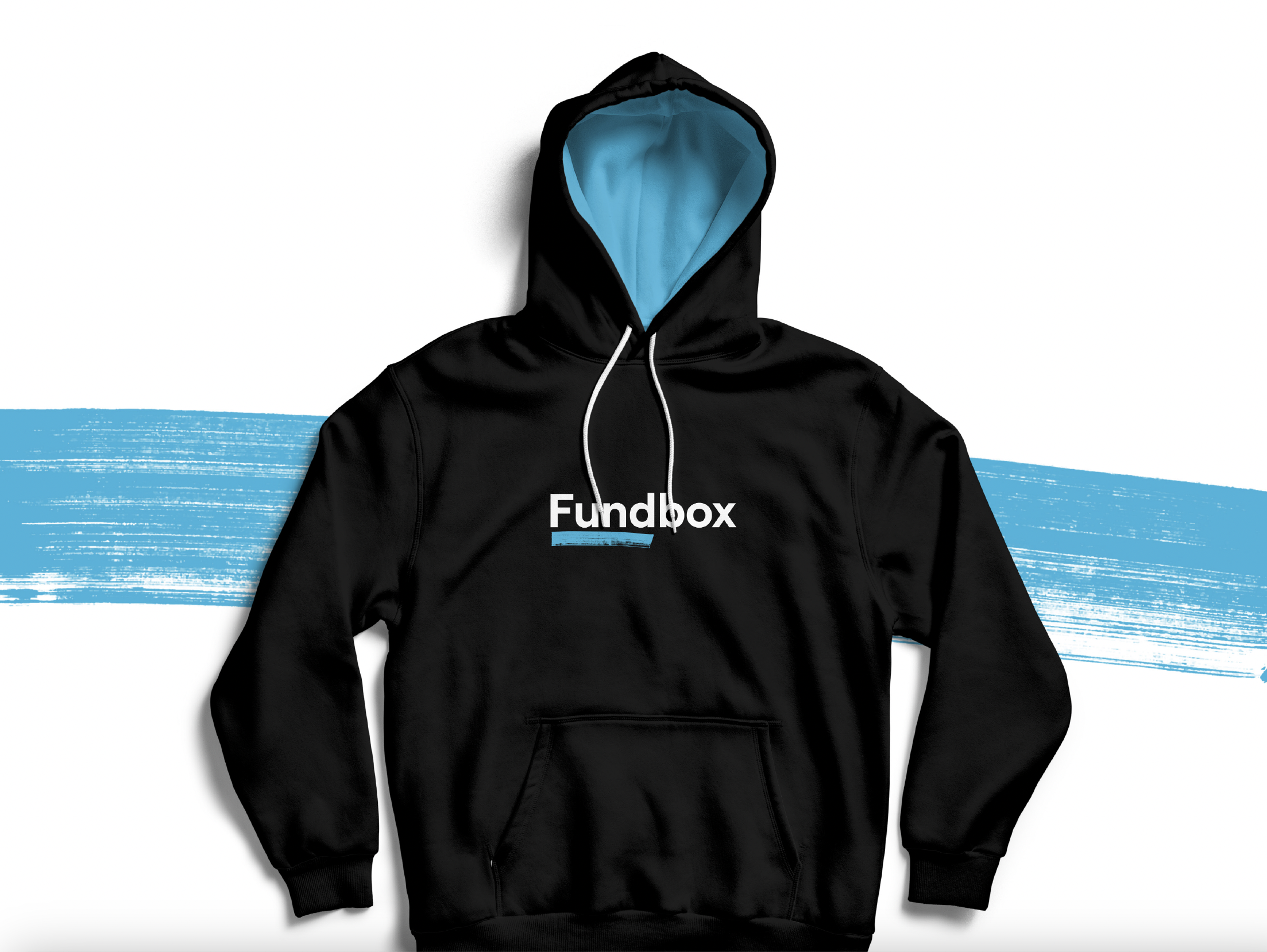
Visual identity
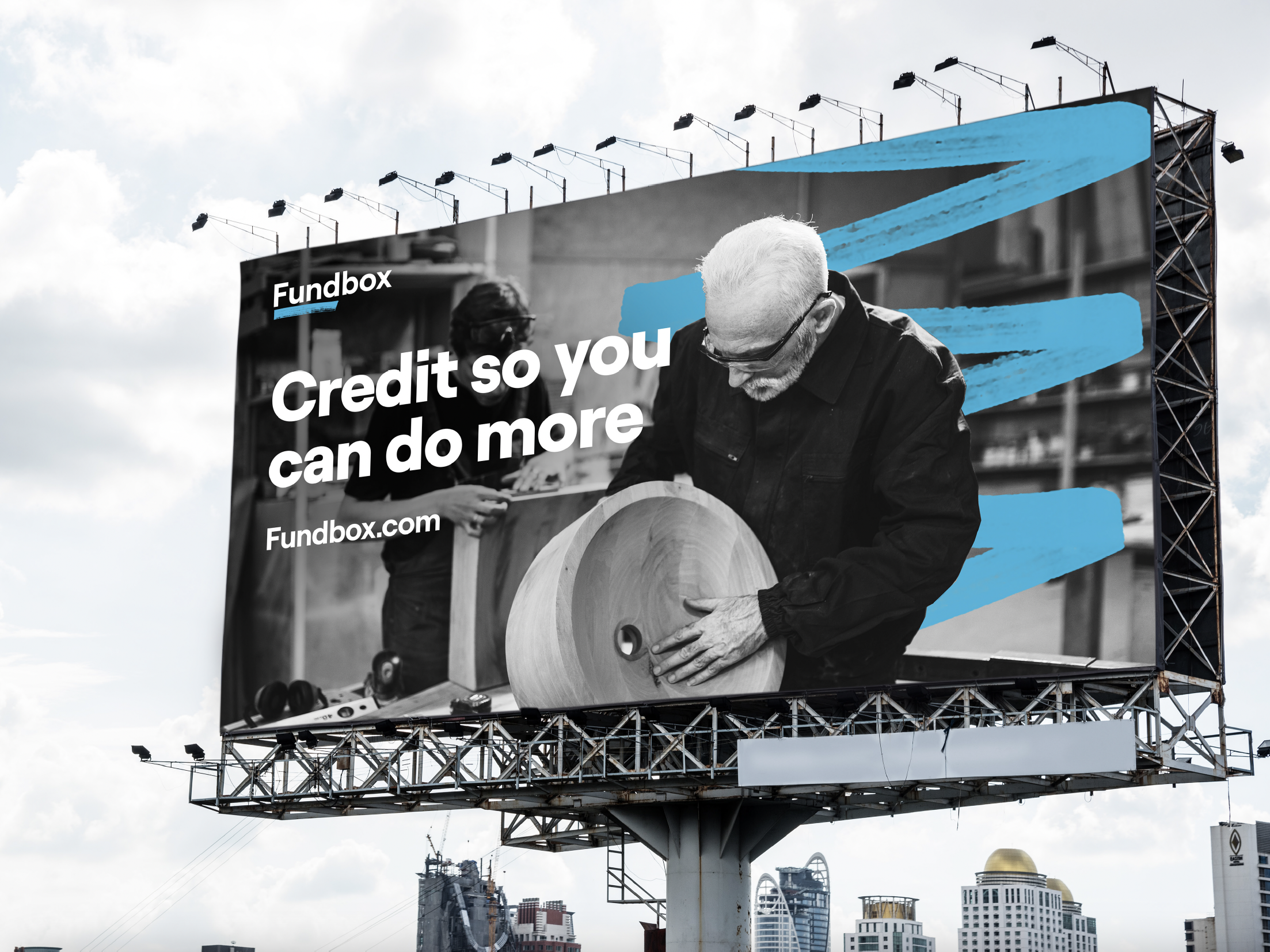
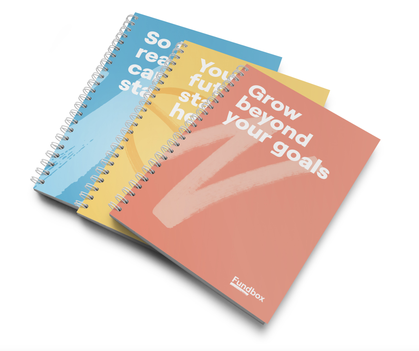
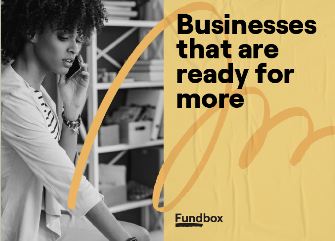
After nailing down the graphic language, color palette and logo, it was time to implement the new brand to various examples - merchandise, marketing materials, print and more.
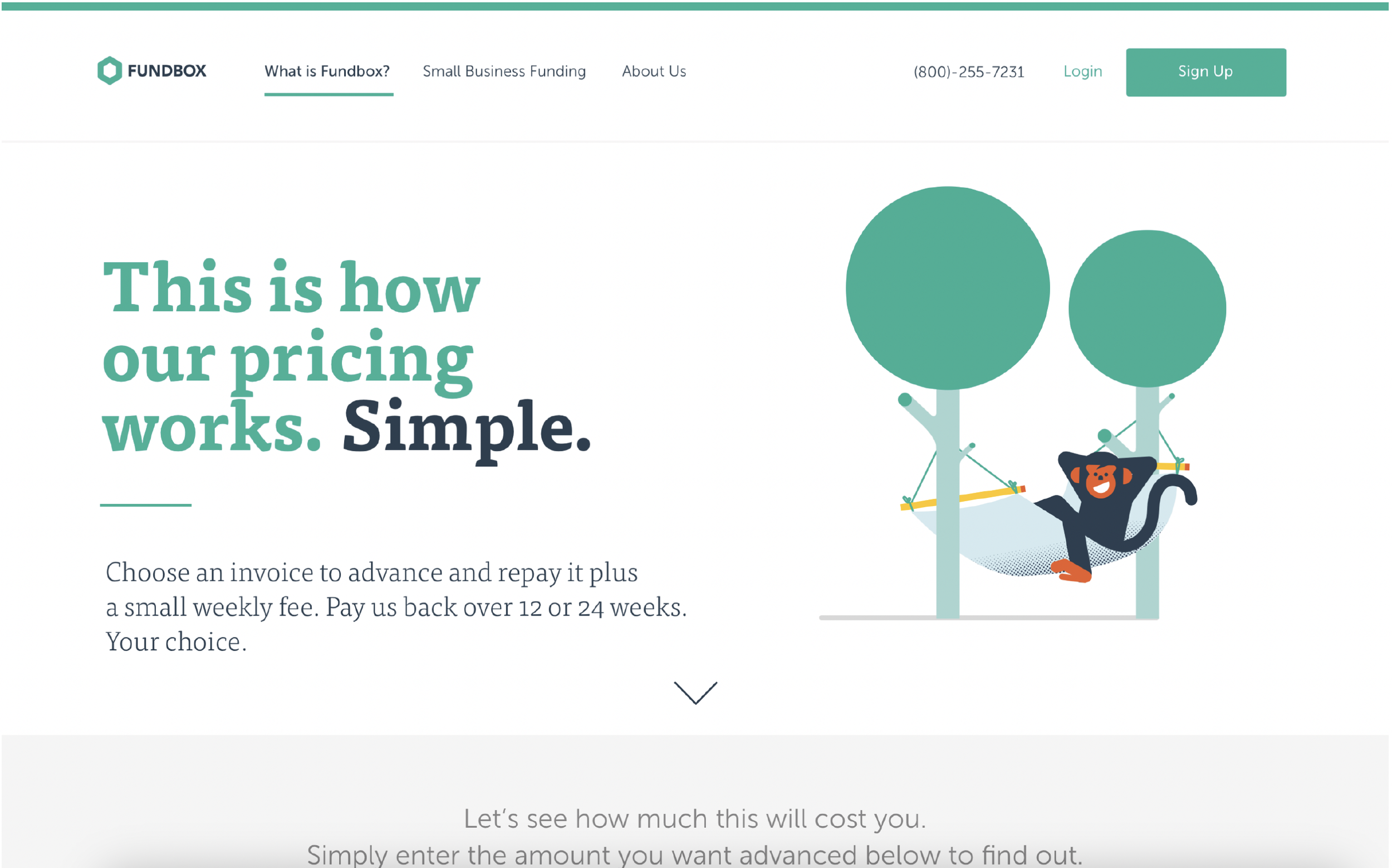
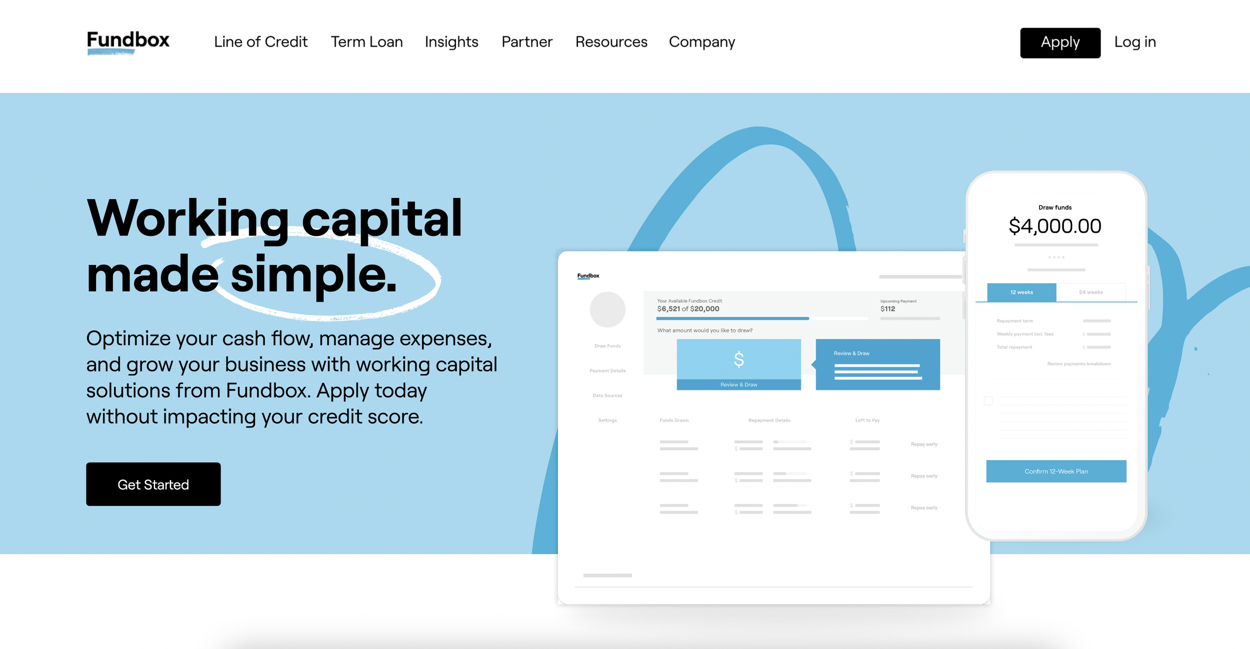
Website redesign
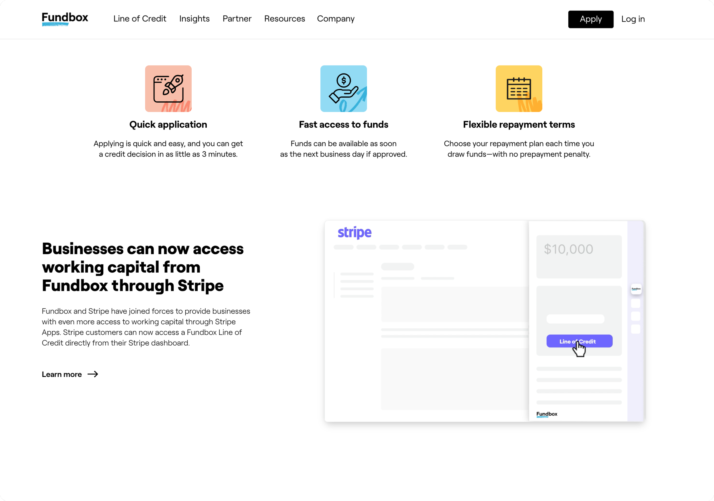
I redesigned the marketing website to launch the new brand. That included building a set of components to be used throughout the website to create consistency, and making sure it’s responsive and accessible.

